The two blogs I picked for this assignment were:
https://artbymoyi.blogspot.com AND http://kbartinquiry.blogspot.com
For Project #1 I enjoyed the photos that were chosen to go along with the elements and principles. You could tell that they all had their own special meaning and they had reasons behind why they picked that element or principle. I could see some other elements or principles that could have been used for their photos but overall I enjoy the ones that they picked.
For Project #2, Neither Moyi or Kelsi picked any of the same artworks that I picked that I had interest in or that I wanted to learn more about. I think it is almost impossible to pick some of the same artworks because there are so many in the Albright-Knox Art Gallery that it gives us many more options to choose from.
I was most interested in an artwork that Kelsi chose by Dan Flavin, called Untitled (to Donna). I really like the fluorescent lights that are in the shape of a square, using the primary colors. I would like know who Donna is though. Is she the artist's sister, mother, wife, girlfriend? Who is she and why did he dedicate this artwork to her.
The comments on my projects basically just agreed with how I viewed the elements and principles and also agreeing with me on why I wanted to know more about the last two artworks that were in Albright Knox. These comments weren't that valuable to me, even though I do appreciate them, only because they don't criticize me and try to make me a better artist.
Friday, October 7, 2016

Sunday, October 2, 2016
Logo Design
-Creating my logo wasn't too hard. I incorporated my initials into the design and then just a basic outline of a flower. Recently I've been obsessed with flowers and I'm even getting a tattoo that has flowers. I think I liked doing the sketches the most because I was able to use a pencil and doodle what was going through my mind.
-During the process I was trying to think of something that I enjoy thinking about or something I just like in general. Flowers is what I came up with because whenever I'm bored I will doodle flowers on a piece of paper or basically on anything that I am able to get pencil to show up on. I then used my initials because I thought it would give a personal touch.
-The most important discovery I had was that I overthink about things too much, such simple design took me a while to think of because I couldn't really think of what would describe me the best. That is what took me the longest.
-I think the most important information was how they showed us the designing process of a logo and how much actually goes into making a logo for a company, because it needs to be original for copyright reasons and then how much creative thinking goes into that because it is hard to think of something without being tempted to go off of someone else's ideas. I liked that the video was very informational about graphic design. I hope videos in the future are more like this module's.


-During the process I was trying to think of something that I enjoy thinking about or something I just like in general. Flowers is what I came up with because whenever I'm bored I will doodle flowers on a piece of paper or basically on anything that I am able to get pencil to show up on. I then used my initials because I thought it would give a personal touch.
-The most important discovery I had was that I overthink about things too much, such simple design took me a while to think of because I couldn't really think of what would describe me the best. That is what took me the longest.
-I think the most important information was how they showed us the designing process of a logo and how much actually goes into making a logo for a company, because it needs to be original for copyright reasons and then how much creative thinking goes into that because it is hard to think of something without being tempted to go off of someone else's ideas. I liked that the video was very informational about graphic design. I hope videos in the future are more like this module's.


Albright Knox Art Gallery
For this project I went to Albright Know art gallery, and it was my first time every going into this place. I can't believe what I was missing out on. This art gallery is so big and there are so many beautiful pieces of art. One art work that made an impression on me was:



For this project I went to Albright Know art gallery, and it was my first time every going into this place. I can't believe what I was missing out on. This art gallery is so big and there are so many beautiful pieces of art. One art work that made an impression on me was:
This artwork had an impact on me because of how big it was. This piece went from the floor to the ceiling and then across the whole wall which was cool to me. It made me think about how long it must of taken the artist to create this piece. I was thinking probably weeks or months. It must have taken a lot of patience for him to finish this.
Artist: Jackson Pollock
Title: Convergence
Year: 1952
Media: Oil on canvas

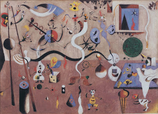
This artwork also had an impact on me because of how different everything in the piece is. Everything in the artwork is super unformed and it looks like the instruments are alive. It is interesting to me because it makes me wonder if the artist was under the influence of something while she created this or if that is just how she likes her art to look.
Artist: Joan Miro
Title: Carnaval d'Arlequin
Year: 1924
Media: Oil on canvas

I feel like I had a connection with this artwork by Andy Goldsworthy because you can actually walk along with the artwork. I think it is cool that Goldsworthy actually carved into the sidewalk at the art gallery and is able to be interacted with.
Artist: Andy Goldsworthy
Title: Path
Year: 2012
Media: Granite

I had a connection with this artwork because I am so familiar with this portrait of Frida Kahlo. Throughout middle and high school we always have been taught about Frida Kahlo in art classes and have been shown many of her different portraits that she painted of herself while she was on bed rest. It was nice to see a painting that I was familiar with and knew some background on.
Artist: Frida Kahlo
Title: Self-Portrait with Monkey
Year: 1938
Media: Oil on Masonite

An artwork I would like to know more about is this one by Nancy Dwyer. It is pretty self explanatory why I'd like to know more about this artwork, it's because it is interesting to me as to why she painted the words "kill yourself" and as to whom she was directing this painting to? Also I'd like to know why she made all the bubbles around it to make it seem like a nice thing to say to someone??
Artist: Nancy Dwyer
Title: Kill Yourself
Year: 1989
Media: Vinyl Paint on Canvas

I would also like to know more about this artwork because I'm confused as to why it is good enough to be in an art gallery. I'm not saying that it is bad or anything but it is just lines on graph paper,something that literally anyone could do. I'd like to know what the artist did that made this piece so special.
Artist: Paul Sharits
Title: Frame Study 15: Study for "Specimen II"
Year: 1975
Media: Ink on Graph Paper
Sunday, September 25, 2016
Color wheel and Value scale


I personally enjoyed creating the color wheel and the value scale for this blog post. I had a fun time creating all the colors and painting them all on the piece of paper. That was probably the media i enjoyed working with the most, the paints, because it's fun playing around with the 3 colors to make the many other colors that are possible. I was surprised to find out that red, yellow, and blue are actually in fact not the real primary colors and that it is actually magenta, yellow and cyan that are the true primary colors because that is not what i was taught as a child. I liked how the video explained why those 3 colors mixed together created a brown not a black and i wish that they would explain more in depth on how to get the black so black. Overall I enjoyed this project and creating a color wheel especially.
Sunday, September 18, 2016
Friday, September 16, 2016
Module 3: Color Theory and Emotional Effects
1.) Color os the way an object absorbs light and then how it is viewed by human. Color can be used to set a mood or theme for something, or to put emphasis on something. The most common thing color is used for is to make something look better or more interesting.
2.) Something about the aspect of color that interests me is the way that color makes something stand out or look so much better if it is vibrantly colored or even just a touch of color making something look so much more interesting. For example, if I'm looking to buy something, obviously I'm going to be more attracted to an item that has more color rather than something that's black, white or gray.
3.) In the color video, the way June Redfern had such a love/hate relationship with her work made the biggest impact on me. Even though her artwork, to everyone else, looked so amazing to her she always felt that it looked bad and always wanted to fix something on it, until she felt that it met her standards.
4.) The biggest impact on me from the feelings video was how such dark colors in a piece of artwork can show us how dark the artist was feeling inside at the time they created their work of art. Also, that applies to when the artist uses such vibrant colors it shows how happy they were at the time of their artwork being created.
2.) Something about the aspect of color that interests me is the way that color makes something stand out or look so much better if it is vibrantly colored or even just a touch of color making something look so much more interesting. For example, if I'm looking to buy something, obviously I'm going to be more attracted to an item that has more color rather than something that's black, white or gray.
3.) In the color video, the way June Redfern had such a love/hate relationship with her work made the biggest impact on me. Even though her artwork, to everyone else, looked so amazing to her she always felt that it looked bad and always wanted to fix something on it, until she felt that it met her standards.
4.) The biggest impact on me from the feelings video was how such dark colors in a piece of artwork can show us how dark the artist was feeling inside at the time they created their work of art. Also, that applies to when the artist uses such vibrant colors it shows how happy they were at the time of their artwork being created.
Wednesday, September 14, 2016
Module 2 Blog Post
1.) In the first video they talk about how aesthetics is the philosophical study of art and the beauty that is presented through art. Picasso, Plato, Aristotle, Hutcheson, and others are all discussed in this video and how their works of art represent beauty, and aesthetics. Later on in the video it talks about modern art forms such as cinema, photography, comics, etc. In the second video Changeux and Ramachandran talk about aesthetics very in depth and how art effects our emotions and our everyday lives.
2.) I believe Aristotle's theory on aesthetics was the most important because he believed that order and symmetry were the "chief forms of beauty" showing how important they are in photography, drawing, and mathematical sciences. Aristotle was alive during the Ancient Philosophy era.
3.) Changeux believes in the scientific genetic envelope for the origins of art. Through the video, he continues on and goes very into depth about the human brain and how we are mentally effected by art. The most interesting thing about Changeux's speech is how he viewed the relation between art and science together as one. Rakmachandran also believes in the relation of the science between art and our brains. I also enjoyed hearing his humor throughout the video. The most interesting part to me was how he showed that a completely distorted Picasso painting was praised by critics even though it looked horrible.
4.) All of the stuff that was talked about in the article was also directly talked about in the 2 videos. The videos just talked more in depth about every point that the article had, making it easier to understand everything being discussed.
5.) I liked how the films were very educational, even though they were definitely on the more boring side. I liked watching the videos better than reading the article because I am more of a visual learner than by only reading an article.
2.) I believe Aristotle's theory on aesthetics was the most important because he believed that order and symmetry were the "chief forms of beauty" showing how important they are in photography, drawing, and mathematical sciences. Aristotle was alive during the Ancient Philosophy era.
3.) Changeux believes in the scientific genetic envelope for the origins of art. Through the video, he continues on and goes very into depth about the human brain and how we are mentally effected by art. The most interesting thing about Changeux's speech is how he viewed the relation between art and science together as one. Rakmachandran also believes in the relation of the science between art and our brains. I also enjoyed hearing his humor throughout the video. The most interesting part to me was how he showed that a completely distorted Picasso painting was praised by critics even though it looked horrible.
4.) All of the stuff that was talked about in the article was also directly talked about in the 2 videos. The videos just talked more in depth about every point that the article had, making it easier to understand everything being discussed.
5.) I liked how the films were very educational, even though they were definitely on the more boring side. I liked watching the videos better than reading the article because I am more of a visual learner than by only reading an article.
Subscribe to:
Posts (Atom)