- For this assignment I chose to watch "Abstract Expressionism and Pop: Art of the 50's and 60's" and "Andy Warhol: Images of an Image". I chose both of these videos because I find Andy Warhol very interesting and I felt that the abstract art video would go along with the video about Warhol because that's his style of art.
-The first video, "Abstract Expressionism and Pop: Art of the 50's and 60's", basically just describes how the trend of abstract art began and where it originated. The video also gives examples of different abstract/pop artists including Andy Warhol.
-In the second video I watched, "Andy Warhol: Images of an Image", talks about Andy Warhol and the beginning, middle and end of his career. Andy is the world's symbol for abstract art and many of his artworks that are known worldwide.
-Both of the videos were very similar to the book in the way that they both describe each topic the same way but the book is more in depth.
-I enjoyed both of the films and how they described each topic. I liked learning about Andy Warhol and seeing his different artworks.
Saturday, November 19, 2016
Sunday, November 13, 2016
Module 11: Art Gallery Visit
Step 1: The Exhibition
-Picasso: The Artist and his Models
-The theme of this exhibition is Picasso's use of models in his artwork and how he uses them. It shows the ways that Picasso used his models to create his art in ways that imitate reality. He usually had his models be his friends or lovers which helped his easily use their energy to create art using various different mediums, converting them from three dimensional objects to two dimensional paintings.
Step 2: The Gallery
-All of the lighting in the exhibition is shining directly on the artworks and only the artworks, really showing their features and details.
-All of the walls in the exhibit are different colors, mostly being darker colors so the paintings stood out, and if the paintings were created out of mostly dark colors the wall would be brighter colors to contrast each other.
-There was nothing really around the floor of the exhibit so it was very easy to move around freely to wherever you wanted to go.
-There were some small sculptures around the floor here and there but nothing major so it didn't effect movement around the floor.
Step 3: The Artwork
-I didn't notice any special organization for the artworks seeing that they were all on separate walls, all located somewhat far away from each other.
-The artworks are similar in the way that most of his subjects in the art displayed were women, most likely some of his old lovers or friends.
-The artworks are different in the way that they are all abstract looking. Some of the artworks by Picasso are hard to tell that the subjects are women because of how abstractly shaped their bodies are. The style of these paintings compared to Henry Matisse's painting called "La Musique" which also is an artwork of two women, is completely different because in Matisse's art you can obviously tell that they are women.
-Some of the artworks are in more dramatic frames, some are in more subtle looking frames and then some artworks don't have frames at all.
-All of the artworks relate in the style, mostly being a woman standing facing the artist.
Artist: Pablo Picasso
Title of work: Femme en vert (Dora)
Media: Oil on canvas
Date: 1944
Size: 130 x 97 cm
Source of picture: https://www.albrightknox.org/art/exhibitions/picasso-artist-and-his-models
Description: The painting shows the body of a woman with the face of what seems to be a cow sitting on a stool. The painting incorporates a lot of greens in it and then the cow's face and hands are blues and reds most likely to make it stand out.
Formal Analysis: The principle used in this painting that stood out the most was emphasis. The color of the woman's face and also her hands is really emphasized by the color of the body and the walls behind her.
The elements used were color and shape. Color is shown by the woman's whole body, face and the walls behind her, one emphasizing the other. Shape is used by the abstract shapes that the woman is created from making her unique.
Interpretation: Picasso is using this woman's body to express maybe what he really thinks of her as a person or maybe even what he thinks of women as a whole.
Artist: Pablo Picasso
Title of Work: Rape of the Sabine Women
Media: Oil on canvas
Date: 1963
Size: 195.3 x 131.1 cm
Source of picture: https://www.albrightknox.org/art/exhibitions/picasso-artist-and-his-models#special
Description: There is what looks like two women laying on the ground screaming and it looks like they are being attacked or are about to be attacked by two men on horses. The men also appear to be fighting. One of the men maybe could be trying to defend the women.
Formal Analysis: The principle used in this artwork is balance. Half of the art is focused on the two men on the horses and then the other half of the art is focused on the two women on the ground. It makes you look throughout the whole artwork.
The elements used in this artwork are shape and color. The objects in the painting are all abstractly shaped drawing your attention to them and then the women are in red dresses really emphasizing them to our eyes with the color.
Interpretation: Picasso is using the women's body language to show that they are really in fear maybe of one or both of the men who seem to be fighting.
Artist: Pablo Picasso
Title of work: The Women of Algiers (after Delacroix)
Media: Oil on canvas
Date: 1954
Size: 65.1 x 72.7 cm
Source of picture: https://www.albrightknox.org/art/exhibitions/picasso-artist-and-his-models
Description: This is a painting of multiple women who appear to be sitting on the floor maybe inside a building or even outside so they could be homeless. They are also painted naked so maybe Picasso is trying to get a point across that they are poor and in need of help.
Formal Analysis: The principle used in this painting that stood out most to me is rhythm. There is a lot of rhythm throughout the walls and on the women's bodies.
The elements used in the art is shape, color and line. The women are once again abstractly painted creating an interesting shape to them. There is many different colors throughout the painting making everything stand out. There are also line throughout everything in the painting drawing your eyes in all different directions.
Interpretation: He is trying to show the struggle women of Algiers had to once face, being homeless and poor. I think he emphasized the situation by making them naked and made them blue and grey to show sadness.
The gallery visit's purpose of me carefully looking at every artwork in the Pablo Picasso visit made me appreciate artwork more than I did in my last art gallery visit. I really paid attention to all of the little details in the art and I really like what I got out of the experience. I hope for my next gallery visit I can say the same thing and get even more knowledge out of the things I am going to be viewing in the future.
Thursday, November 10, 2016
Module 11
-For this assignment I chose to watch The Impact of Cubism because cubism is something that I've never seen before and it sounded interesting to me. I chose Surrealism and Dada for my second video because it is also something that I would like to learn more about in the future so I figured it would be ideal to watch it.
-KEY CONCEPTS
The Impact of Cubism: Cubism art is art that is straight and has harsh corners and lines that are very defined. The titles of the art often define the subject matter of the artwork. Most of the time the art can be taken apart and put back together again.
Surrealism and Dada: Surrealists are ofter artists who like to believe in fantasy and dreams and most of the time stay away from real life. Dada expands what art could be combining objects together to create something better.
-The video on Cubism mostly talked about Cubist artists and each of their different artworks and why they created them. The book also talked about the same thing just a little more in depth. The book also gave a good definition of what Cubism is and how it is used.
The video on Surrealism and Dada went into depth about the artists and their artwork, more so than the book did. They also talked about the history of this compared to how it is today and talked about the differences.
-I enjoyed both of the films very much so. I enjoyed how they both went into depth about the different artists there are and their different styles of art. I wish that the videos would go just a little bit more into depth than they did so then we wouldn't need to use the textbook as a backup reference.
Sunday, November 6, 2016
Module 10 Mask Making


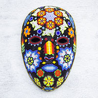
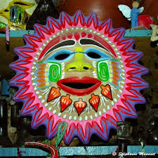
I chose these three masks as my inspiration pieces because I wanted to create something that was colorful but also had the shape of a sun. The sun is something that is interesting to me, because of how far away it is from us but it is still so hot in the summer and can look super big sometimes, especially during sunsets and how it makes the sky so many beautiful colors. I wanted to incorporate that into my mask.

My sketch and final mask are inspired a lot by the first example picture I have in this blog post, shape wise. I tried my best to get it to look like a sun but considering I'm not artistic at all, I wasn't as successful as I would have liked it to turn out. I incorporated shape and color as well as value into my mask because I varied the different shades of red, yellow and orange into the mask to represent a sunset.
My opinion on this project is that it was okay. It's kind of hard to create such a unique mask after looking at so many different ones and then getting ideas from them and then branching off of those ideas. Not my favorite project so far this semester.
Saturday, November 5, 2016
- For this assignment I chose the video about African art and Buddhism. I chose both of these because they are the ones that I had most interest in. African art is interesting to me because of how it incorporates animals into the art most of the time and I chose Buddhism because I would like to know more about it.
-The video "African Art" shows how art is apart of the daily life in Africa. Rock carvings and paintings are usually animals, in the rock carvings the animals aren't as easy to tell what animal it is and the drawings are more specific and it is easier to tell what kind of animal it is. They also talk about how Zimbabwe's architecture is different than what is in Europe. This shows that the architects in Zimbabwe aren't as informed as the architects in Europe. Older images show a wider range of style. Each region or civilization had individual priorities or rituals that would translate into unique symbolism.
In the video "Buddhism" they talk about how the religion that is originally from India has spread all across Asia and more people are practicing it. Buddhism has inspired many different architectures throughout the world. One symbol of Buddhism that is very popular around the world, even in the United States, is the Buddha. There are paintings, statues and many different other types of things that display him.
-The videos are both similar to the textbook in the way that they both are explained. The videos and the textbook both explain what Buddhism is and what African art is. The textbook goes more into depth than the videos but I liked watching the videos better.
- I liked both of the videos more than reading out of the textbook even though they didn't go as in depth as the book did.
Subscribe to:
Comments (Atom)


